2009
Product
Rebranding of DANZKA vodka
Modern, elegant and exclusive were key words in our process with redesigning the logo and overall look and feel of the Danzka brand.

project overview
| Client | Belvedere Scandinavia A/S |
| Year | 2009 |
| Creative Direction | Johannes Torpe |
| Material | Anodized aluminium |
| Services | Logo design, Graphic Identity |

design focus
Danzka came to us with a wish to further strengthen and underline their position as a Danish premium vodka brand. Modern, elegant and exclusive were key words in our process with redesigning the logo and overall look and feel of the brand.
Danzka Vodka has a Danish heritage in both its design language and from the fact that it is made purely from Danish whole wheat. The bottle itself is modelled over the classic shaker known from cocktailbars.
The final result is a graphic design that makes the bottle appear more slim and elegant. We additionally cleaned up the amount of text and achieved the desired simplicity and exclusiveness. The design language we developed is still used to this day.

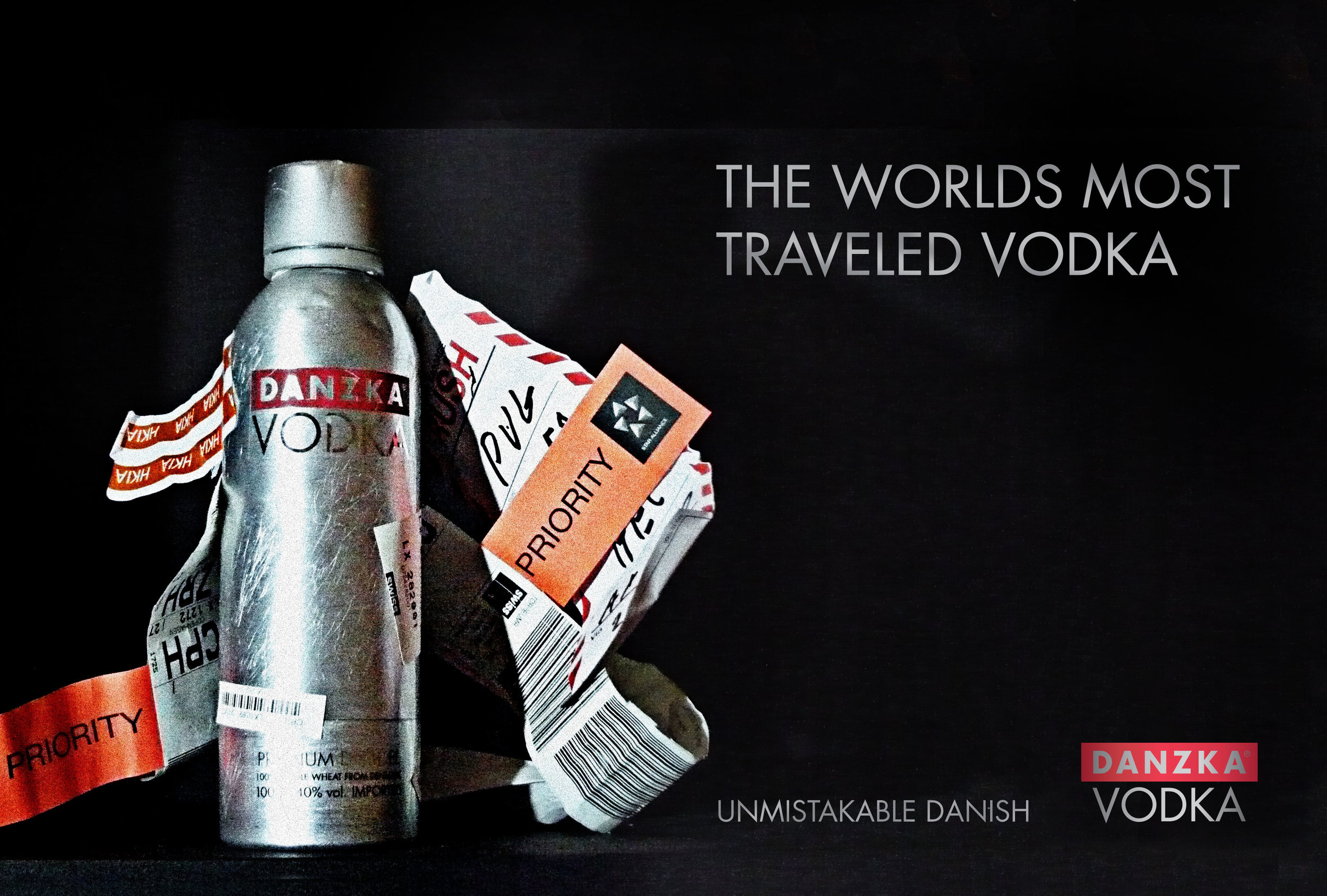
The advantages of the aluminum bottle are many. The content chills faster and stays cool for longer, it is almost impossible to break and it is light and easy to travel with. The later become the inspiration for a world wide campaign: The Worlds Most Travelled Vodka.